

In October 2022, we’ve decided to create a unique brand and website for Enabler that aligns with our values.
At that time, we've been using Squarespace for just a basic website with information about the company. So in October we’ve got in contact with absolutely brilliant designers that helped us create new brand for Enabler.
Design
We've collaborated with great designers, Mateusz Staniszewski and Artur Tuchowski from Poland, to create a brand new website design.
Mateusz is a Senior Product Designer, specialised in Design Systems and Artur is Senior UX/UI Designer. They have a lot of experience, and after our initial meeting, we were confident that we wanted to collaborate with them for the upcoming months.
So we started having workshops led by Matt to find out what our values, goals, and purpose are behind what we do.
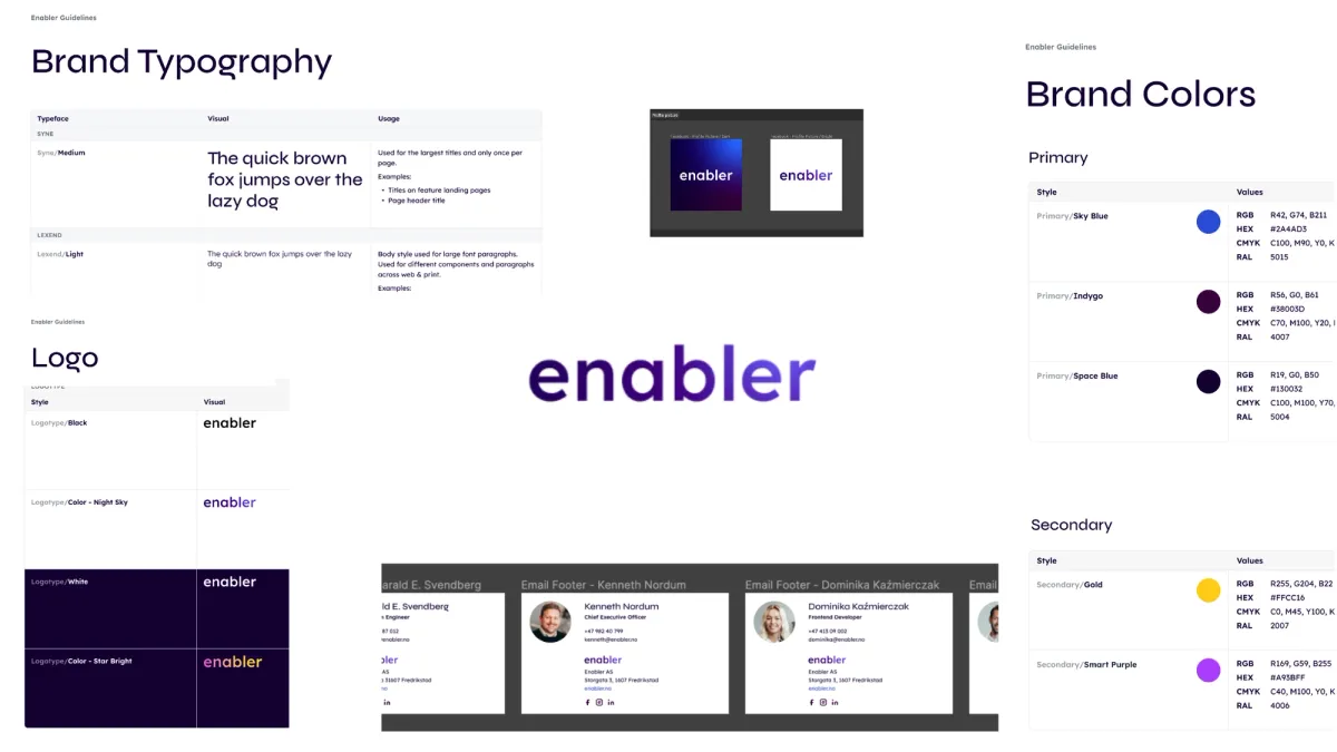
After several workshops, discussions, and rounds of feedback, Matt supplied us with ready-to-use Brand Guidelines and Brand Elements.
The Brand Guidelines provide information about colors, typography, and logos.
Meanwhile, Brand Elements include social media profile pictures, cover images, email footers, resume templates, and desktop background images, among others.
And once our brand was ready the next step was to create a new website for Enabler.
Following several meetings with Artur, he grasped the type of website we desired and crafted a stunning design that incorporated our new fonts, colors, and logo.
The entire branding process took about three months. Our developer, Dominika, then took over and began implementing the new design on the website.
Technology
It was important for us to create a responsive and fast website using modern technologies. Here are the technologies we used to create the website:
NextJS
Next.js is powerful framework for building performant, scalable and maintainable web applications. It allows us to generate static HTML files at build time, which improves our site's performance and reduce hosting costs. It makes the website much quicker, comparing to other solutions.
It has a great solution for optimising images for different devices and screen sizes.
It offers lazy loading to enhance page load times and priority image loading. This prioritizes the loading of essential images on the page, ensuring they load as quickly as possible for an improved user experience.
Another important solution is the font loading optimization library, next/fonts. It enhances the performance and usability of a webpage by optimizing how fonts are loaded and rendered.
Tailwind CSS
We chose Tailwind CSS, because it helped us develop our webpage faster, using pre-defined utility classes, that we used to quickly apply styles to HTML.
We can easily customise these classes by adding our own colors, fonts, and other to the Tailwind config. This allowed us to create a unique design for our website.
Tailwind CSS also supports styling any vanilla HTML that we cannot control, such as content from articles pulled from CMS.
We used the @tailwindcss/typography plugin. This plugin offers a set of prose classes that can be used to apply default styles to headings, blockquotes, links, and more.
module.exports = {
  theme: {
    extend: {
      typography: theme => ({
        DEFAULT: {
          css: {
            '--tw-prose-body': theme('colors.dark-secondary'),
            'line-height': 1.5,
            h1: {
              'font-size': '31px',
              'font-weight': '500',
            },
            ...
            h6: {
              'font-size': '14px',
              'font-weight': '500',
            },
            blockquote: {
              'box-sizing': 'border-box',
              color: 'rgba(19, 0, 50, 1)',
              'font-size': '20px',
              'border-left': ' rgb(255, 200, 0) 3px solid',
              margin: '40px 0',
              padding: '0 20px',
              'font-weight': 500,
              'font-style': 'normal',
              'line-height': 1.3,
            },
            strong: {
              'font-weight': '500',
              color: theme('colors.dark-secondary'),
            },
            a: {
              'font-weight': 500,
              'text-decoration': 'none',
              color: theme('colors.sky-blue'),
            },
          },
        },
      }),
    },
    plugins: [require('@tailwindcss/typography')],
  },
}
Tailwind CSS makes it easy to maintain a consistent, responsive design and user experience throughout website.
Sanity
Sanity is a headless CMS (Content Management System) that we used on our website.
It allows us to define custom data models, so our data is organised the way we want, making it easy to work with.
We used @sanity/image-url, as one of the dependencies to retrieve any crops or hotspots present in the Sanity content.
We can specify the width and height to get cropped and resized image according to the wishes of the content editor.
We can also specify the format or quality to obtain the most optimized images.
Next/image combined with @sanity/image-url:
<Image
  className='z-0'
  src={urlFor(article.image)
    .fit('crop')
    .crop('center')
    .width(3600)
    .height(2400)
    .format('webp')
    .ignoreImageParams()
    .url()}
  alt={article.image.alt}
  fill
  priority
  sizes={'100vw'}
  style={{ objectFit: 'cover', objectPosition: 'center' }}
 />
Midjourney
We used Midjourney to create unique images on our website.
Midjourney is a generative artificial intelligence program and service. It's created and hosted by Midjourney, Inc., an independent research lab located in San Francisco. Midjourney generates images from natural language descriptions, which are called "prompts."
We are very pleased with the outcome. Hopefully, you will like our new webpages and profile as much as we do!


Uptime monitoring with GitOps and Application Insight
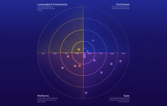
Tech Radar: Enabling Insightful Technology Decisions